I am excited to have listed some beads and jewelry to the shop today! Remember when I listed those beads for the "Coffee Lover's Cup" necklace tutorial(to be featured on the Art Bead Scene Blog)? Well I have just listed the necklace and of course some matching earrings!
Did you see those awesome wavy vine daisy earrings a little while back? Those are in the shop too!
You'd rather make your own stuff? Well I have some more awesome Raku beads in the shop!
"Coffee Lover's Cup" necklace. I mean WOW! If you LOVE coffee like I do, then I'm sure you will love this necklace! It has all of that funk mixed-media goodness with lots of wonderful materials like: recycled sari silk, chain, leather and rubber and of course, lampwork headpin drops, with a coffee mug and heart focal!
"Coffee Lover's" earrings. What good is a FABULOUS necklace without some equally awesome earrings?! The paddle droplet even has a teeny tiny coffee bean accent and a heart for the other ear!
Here is what they look like together. A match in heaven if you ask me ;)
"Khloris" named after the goddess of flowers. Remember these from my post on Facebook? Well here they are in the shop just for you! I just LOVE how bright they are! I had this idea in my head for awhile before they came to be and I couldn't be more excited about how awesome they turned out!
Here is what they look like on. They are so full of movement and so light!
"Cream Rainbow Ribbons"- a wonderful ribbon of rainbows on a super creamy base of delicious ivory. These would be perfect with the other raku sets in the shop!
"Desert Serpent Jewel Sampler" - a little bit of this and a little bit of that and some NEW designs! A new style "Black Ribbon Jewel" headpin, a "Rainbow Pod" headpin and a "Cream Swirled Sand" headpin. Did you see I even included a black annealed steel wired bail ready for your wire-wrapping finishes? I was SUPER excited about the new tweak on the "Desert Serpent" lentil design with a "bubble button jewel" dot in the center and let's not forget the newest additions.... "Rainbow Sticks" inspired by the glass toggle bar I made for Gail's bead soup!
Here is a closer look at those "Rainbow Sticks". Pretty sweet huh?!
SO WHAT ELSE IS NEW?...
So you may want to know if you won the give-away huh? Well I am waiting for my beady helper(my darling husband) to return home from work. We will be picking a name soon and let you know soon!
Well I better get ready to go to Last Thursday on Alberta street! I can't wait to see the art this month!
Happy Thursday! So where have I been for btw? Well I no longer have a bead table since my move! Sad face, huh? It's ok though. I have been busily creating beads for you in the mean time. I will get a beady surface coming up here so I can work on some more designing. For now what's left of my computer desk and night stand will have to suffice.
I took advantage of the SUPER bright sunshine on the summer solstice to do some photographing for the items I am listing today. I am always pleasantly surprised at just how beautifully sunlight kisses glass :D I'm sure you will agree when you see the photos below!
So what's new, you ask?
"Coffee Bean Blend"- remember these? They were in and out of the shop quickly so I wanted to make another set. I really LOVE the sculptural style of these headpins, especially in a coffee theme! :D
"Coffee Bean Blend 2"- Ok so you are wondering the difference, right? Same awesome shapes with a little switcheroo on colors ;)
"Green Sea Paradise"- Yum, huh?! All of my favority stuff! Lime and aquay, glittery, odd lotty. Ok so the y's don't work on everything but the colors and finishes sure do! :D
"Rainbow Streamers"- I know, they totally look like balloon's right? With the spiral they totally reminded me of party streamers. You know, the kind you make by running them along scissors? So fun! They totally make me happy with their rainbowiness and shininess.
Wing Dings "Bright Earth"- is that an oxymoron? I dunno, but that's what they are, bright and earthy all at the same time! Isn't this color scheme MAGICAL?! I took my "Earth Blushes" Wing Ding Waterfall necklace colors and added a few extras to make this set of 7. I really LOVE this wonderful color gradation of multi colored glass!
I know, I totally owe you pictures of Portland too. I am slacking. Honestly I am all pictured and descriptioned out at the moment. I promise to add some of my favs soon for all of you that aren't on facebook.
Well it's 4pm here and I am STILL in my pj's from this morning when I started my listings so I think I'm going to get dressed and enjoy the afternoon/evening.
Wow has it been awhile since I listed. It feels really good to be back in the rhythm again!
"Grape and Raspberry"- a gorgeous sampling of the pretties pinks and purple droplet headpins on copper wire :) I am almost out of these pretty odd lots so grab 'em while I got 'em!
"Jaw Breaker" opaque and transparent spiral headpins made to match my "Jaw Breaker" hollow bead and disc set that was published in Glass Pattern's Quarterly 2011. The red is more red than it appears in the photo.
"Jaw Breaker" wing dings! Bright bold colors like the teeny jaw breaker candies I used to buy when I was a kid :D Also made to match the "Jaw Breaker" set that was published ;)
"Love the Bean" and ode to coffee and my love for it. Made in awesome earth tones.
Well that's it for today! The sun is shining with warm weather and a nice breeze. I'm off to walk Leeloo before the sweltering heat and humidity return to Kansas City!
I must be a glutton for punishment! Here I am hours later back at the computer again blogging to you after 3 LONG hours of listing on Etsy. 3 hours, can you believe it?! Wow! Well I am back for a few reasons- 1. I am feeling more human now than I have felt in a few days being sick and all. 2. I am so excited about my new designs I couldn't wait until tomorrow. 3. Since the hubby decided to go to bed early I'm not cutting out on our time together so I don't have to feel bad about sneaking away to my studio to blog :D
Well if you managed to head over to my shop before reading this you may have noticed I got a little WORDY on my descriptions. I felt kinda bad that there was SO much text, but there are SOOOOO many details on these pieces I felt obligated to do my best to describe them in words as well as pictures. So I will be keeping the descriptions a little shorter here to make up for it ;)
NEW IN THE SHOP.....
This new series of jewelry was inspired by my very FAVORITE summer coffee, Gazebo Blend brought to us by Starbucks. I was inspired by a paper card that came with the coffee, I believe last year. I loved the floral designs and color palette so I used that as inspiration for my beads and colore scheme."Gazebo Cafe"- Here it is!! This is my very FIRST mixed-media piece of jewelry and the inspiration for all of the other designs! I used the original paper card to make soldered charms that you see on the left side of the necklace. On the back side of the soldered charm is matching scrapbook paper.
I also recycled scrabble tiles and turned them into soldered charms that spell "Cafe". I had wanted to spell "Coffee", but the design worked much better by using only 4 letter tiles so that I could use more beads on the necklace.
I also made some new glass headpins! You can see them on the right side where "Cafe" is spelled.
As you can see the design is totally asymmetrical and I used the following beading techniques: stringing, wire-wrapping, and knotting. Necklace measures 19 1/2-20"(48.26-50.8 cm)adjustable.Here is a close-up of the "Cafe" tiles. Close-up of the soldered charms. Some of the collection all worn together in a set. Isn't it beautiful all together?! The jewelry is very comfortable and has a wonderful weight to it. Not heavy at all for the amount of beads on it! Especially the earrings! :D
"Gazebo Garden"- Upcycled from the original coffee card, I made soldered charms. Accents include my handmade glass drop dotted headpins, knotted colored leather with spacer beads, a strung glass bead design, dangly crystal rings and a coffee cup at the clasp! This is my FAVORITE bracelet out of the series! Bracelet measures 7 1/2"(17.78cm). Here is the back view of the bracelet.
"C" is for Coffee- What a delicious cup! Fun asymmetrical design is composed of: recycled scrabble tile "C"'s made into soldered charms, an oval glass bead(that looks like a coffee bean), Swarovski crystals, Hilltribe silver stamped spacers, and a leather loop with a spacer swinging inside! These earrings dangle 3"(7.62cm). They are surprisingly light for as many beads as are on them and very comfortable to wear! "Gazebo Botanical"- A super fun and funky lampwork bead bracelet with botanical designs based on the Gazebo card designs with brown swirls and dots on the back.
Spotty spacers are "floating" beads that slide over tiny faceted seed beads.
On the textured silver chain "floating" Hilltribe spacers create fantastic movement accented by my glass tear drop spotty headpins.
On one side spacers are knotted on colored leather with a dangly crystal ring and on the other a lampwork bead wire-wrapped with crystals brings the design back to the toggle. Bracelet measures 7 1/2"(17.78cm).
Super fun with lots of movement, color and texture! "Cup of Gazebo" reversible necklace. The original "Gazebo Blend" sticker was recycled and made into this incredible soldered pendant. On one side is a beautiful flower garden scene and on the other is a warm sun against a blue sky the words "Gazebo Blend" are inside the sun.
Dangles cascade from silver chain with: Swarovski crystals, czech glass flowers, and a spotted coffee cup. On the sides sit a brown oval coffee bean bead and a heart stamped charm.
Necklace is strung on an espresso brown adjustable necklace measuring 18-20"(45.72-50.8cm) adjustable. The back view of above necklace.
"Cup of Gazebo" earrings- 2 sweet little spotty mugs with delicious Gazebo coffee inside. Cascading down the chain are: sparkling Swarovski crystals, Czech glass flowers and a brown oval coffee bead. "Cup of Joe"- dangle ring features a spotty aqua and coral mug, a dizzy caffeinated silver spiral and a brown coffee bean bead on a size 7 sterling silver dangle ring. "Dark Roast"- sweet and simple red brown coffee beans dangle from sterling earwires. "Medium Roast"- light chocolaty brown coffee beans simple dangle from sterling silver ball ear wires.
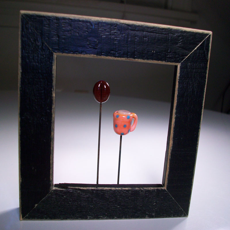
NEW Lampwork Home decor! I was excited to make these new tiny wall art designs in this fun coffee theme! "Cafe au Lait"- a little scarlet mug with coral spots and a red brown coffee bean are suspended in a tiny upcycled black frame. Measurements are 4"(10.16cm)tall by 3/4"(7.62cm) wide by 4"(10.16cm)across. Zig-zag metal assembly on back for easy hanging. "Light and Sweet"- Tiny coral and aqua speckled mug and red brown coffee bead are suspended in a tiny black upcycled frame. Measurements are 4"(10.16cm)tall by 3/4"(7.62cm) wide by 4"(10.16cm)across. Zig-zag metal assembly on back for easy hanging. The name "light and sweet" came from the way my friend Ashley described the coffee she had brought me one day. The terms mean with lots of milk and sugar :)
Well there they all are! Wasn't that EXCITING! I had so much fun working on these new designs! I can't wait to work on some more fun mixed-media pieces!
The artbeads.com fall blog is right around the corner. I have just placed my order for the blog and I can't WAIT to get the new items! I have all kinds of amazing designs bouncing around in my head!
I also found a place to order some super awesome and BRIGHT tiny leather cording like you saw in the designs above. I can't wait to get my hands on that and make some funky new stuff!
Thanks for celebrating with me about my design process and new pieces! I hope you enjoyed looking at them as much as I enjoyed creating them!
I might just be crazy. Pretty sure I am sick for sure. I tried to pass this nuisance off as allergies since I have fall allergies something fierce, but alas after my cocktail of pills in including: 1 generic zyrtec, 1 generic claratin and 1 generic benadryl I came to the conclusion that I must indeed be sick :( As you may know, I HATE being sick. I am a busy person so I hate to waste time with silly things like being sick. Thankfully I have an amazing husband that has run out to the store for tissues, holistic cold killers(Umcka), and of course whatever foody item that sounds good to me at the moment. I will say I miss drinking my morning coffee(which never sounds good when you are sick.) and I hate not being able to taste things as well.
So what am I currently taking to get better? 1 packet of Umcka(you need to take 5 a day for 2 days to help knock out your cold), 1 benadryl(until it wears off then down another), 2 echinacea, and 2 vitamin c(twice a day), simply juice orange juice and whatever food sounds good. So far I have had a yummy hot and sour soup from our favorite Chinese restaurant by the house. Later I will have some grilled cheese on eziekel bread with boars head american cheese, and tomato soup :D
Ok waaa waaa waaa about my sickness.. onto the real reason you come to read about my ramblings. Beads, right?
MIXED-MEDIA DESIGN...
Ok so you may or may not know that I have really been digging this mixed-media style jewelry right? So off I went to start designing. First of all when you design you need an element right? Well my love of coffee and Gazebo Blend by Starbucks lead me to the bead designs below. If you don't already know about Gazebo's awesomeness it's an African coffee(which are my favorites) and it's only out in summer around Julyish and some of August. So I am sorry to say that the link above will leave you empty handed, but just so you could get more info I attached the link.
I was inspired by some art that came with the packaging awhile back. I want to say it was 2009, but I could totally be wrong. I WISH I would have taken a picture of the card I had made into many soldered charms seeing as how it has been damn near impossible to find a picture of it. The ONLY picture I could find was the picture of the tiny Gazebo Blend sticker(which I also made into a soldered pendant). So I apologize about the tiny picture. The sticker is a little bit different colored than the actual card, but you kinda get the idea.
Ok here is the picture. Pretty isn't it? Some of my very favorite colors. Some bright and some earth tone. So what to do next? Choose the glass colors that most closely match the picture.
Here you can see the star shaped stacked flower. I started out with a red because I didn't have a closer match to the picture. That and the other color I chose was very close to another one of the stacking colors. Why does this matter? If there isn't enough contrast between colors the layers wouldn't be as defined. As you can see in 1 I started out with red for the bottom color. I tried layering the dots and raking the glass with stringers to get the shape. As you can see I wasn't super successful. It's so strange to me how the very first design I attempt looks like poo and the next one is not only better, but like 10x better. Weird...
Number 2 you can see I chose a different color for the bottom. This time I used coral. Ok so the color was better and the flower was puffier, but with all that stacking and raking I couldn't get the design I wanted on such a small bead.
I chose the larger size lentil for the base in the "design pick" bead and that seemed to work out the best. You can see all of the details of the flower along with nice pointed star petal ends.
The yellow ocher/ rust colored flower. I liked the flower labeled 1, but I wanted the flowers more pointy. As you can see in the "design pick" bead I got the petals much more pointy. Would you believe that's the same glass on both flowers? I got a really nice batch of Red Roof Tile that is kind of terra cotta and yellow ocher colored. I LOVE it.
Next onto the more "reddish flower". This one was a little harder to color match up. At first I wanted to use the True Red Coral odd lot I had, but it just wasn't quite the right shade for me. I ended up using a batch of Coral instead.
1 ended up being the "wrong" color. 2 was a raking job nightmare. It's all mushy and distorted looking. "Design pick" was "just right" with the coloring and shape.
Spiny tulip. Now this bugger gave me fits. As you can see it took me 5 beads to get the design I wanted. Bead 1 I was still using the red color for the beads before deciding to change to a different color. Bead 2 another trial of the first. Bead 3 yet another trial some of the other colored glass snuck in with the rakes. Gah! Bead 4 you can see where I patched it on the right and the petals still weren't pointy enough for me by just raking the glass.
"Design pick" Ah! There we go. I not only got most of the little details I wanted, but I love the spiny petals done by heating a small ball of glass from a stringer and pushing and raking it upwards towards the top of the bead(this is the same way you do leaves). The finished bead reminds me of the Super Mario games or the plant in "Little Shop of Horrors". At any rate I LOVE this bead!
Now for some more coffee related designs in the same color palette....
The glowing coffee bean. This little guy has the rays of light around it with the nice little "Ahhhh" that you hear when you see glowing things desired. 1 I didn't really like the rakes of glass. It was a little too much yellow and looked like a starfish with a coffee bean on top.
"Design pick" was just the right amount of "rays" for the look desired.
Steaming cups of coffee. Ugh.. as you can see this one took me quite a few times. 1 you can see the steam designs are kind of scraggly looking and messy. 2 you can see better squiggly designs, but because of the shape of the heart I couldn't squeeze in a tiny spiral just above the cup and it made the steam look like "whiskers" or something.
3 after choosing 3 different colors for the possible steam: Messy Cirrus, Messy Marshmallow and effetre Anice White. I did a quick blog of glass to try out the other colors to see if their translucency showed up layered on top of glass and found that it just looked more like clear(Bummer! They are the perfect color for steam by themselves, but their translucency doesn't show up on top of a color.). Next I decided I didn't really want something quite stark white so I chose effetre Anice White. For the design I did a few twists with cold stringer to get the swirly billows of steam, but wasn't too excited with the results. I was still running into the space issue at the "v" point of the heart there just isn't enough glass to decorate.
"Design Pick" was going to be the finished design. I guess I would just have to give up on my steam swirls on a heart design due to the lack of space and look of the steam with the space given.
I guess I will just have to use the steam design on beads like this older design of mine.
SOLDERING CHARM TIPS....
While I wish I would have taken some pictures of the soldered charms before they were made into jewelry I do have a list of things I learned about soldering to share. I am by no means and expert at soldering charms, but in my short bit of making them I have learned so much and really learned the most the last(most recent) time I made them.
1.Gravity works, that’s why it was invented. Use gravity to let your solder flow.
2.Think of your solder like water. When it’s hot it flows like a stream.
3.Solder will go where ever the heat is. Use the heat to make the solder go where you want it.
4.Take a deep breath in and exhale while doing a stroke of solder down a surface. Not only does it relax you, but it allows you to let the solder glide across the surface.
5.If you think you have enough solder add more, you want a nice thick coat of solder to push around for nice edges.
6.Be patient. If it’s not working out, take a break and come back.
7.If the solder isn’t flowing enoughadd more flux. The get along well.
8.CLEAN YOUR IRON. If you notice patina on the iron clean it on the sal ammoniac bar. It shines up the patina on the iron and seems to help the solder flow better.
9.Clean off ALL sticky tape residue.If you notice black spots on your solder it’s the tape residue.Scrape off with a razor and then apply more solder. Notice how it sticks this time?
10.To do the “beading” technique on the sides get a generous amount of solder and put the charm on it’s side. Use the thin tip of the soldering iron and hold the iron vertical. You want to heat the solder and almost let it “drip” down the side. This gives you that gorgeous bubbled edge :D
11.You can scoot solder to one edge by going from top to bottom almost like you are brushing hair. When you have “brushed” the solder to the one edge heat and glide along your new formed edge to smooth out the solder.
12.Like lampworking it’s ALL ABOUT HEAT CONTROL! Learn how the heat moves the solder and you’ve figured everything out!
13.Marvel at your accomplishment :D
14.Let your iron get HOT. The hotter it is the better the solder flows. An iron that is too cold is useless and will just make you want to throw your pieces at a wall.
15.If you have a dimply texture to your metal add some more flux and run the iron over it. It should smooth out.
If you have ANY questions about jewelry assembly technique, lampwork, soldering or anything else please feel free to message me. I know how terribly frustrating it is when you are trying to figure out what is going wrong with your technique and have no one to ask at the time you are creating!
Stay tuned for the finished pieces! You are going to LOVE them!
Much love,
Genea
P.S. What do you think of the new "clothes"? It's not lime green and aqua, but it's bright, has swirls and lots of color! <3