Third Eye Gypsy(Genea Beads) 2011 by Parigo Studios 2010

Showing posts with label bullseye glass. Show all posts

Monday, October 31, 2011

Too many facets

Hello friends!

Do you have too many facets too? I have come to realize that lately I do so many things that I have too much variety in my business. Strange problem to have huh? I guess I just never want to get bored or feel trapped by just doing one thing. I have SO many great ideas and it's like each one of them could be it's own business!

Learning this about myself makes me happy because it means I am very creative. Instead of being able to work in just one medium I can work in many and surprising to me I am quite skilled at it as well. I do excel more in some areas than others for sure.


So where am I going with this? Well I will be sort of doing my first business related project. By business I mean I will be creating something in glass for another business in their theme!

So what is this new project?  I am creating some pet themed necklaces and keychains for Advanced Animal Care of Colorado! 

So a little side story on how we got hooked up... Ricky's mom works for Dr. Steyn at the clinic. They were brain storming what item they could give to their clients that had lost a beloved pet. My MIL suggested that they contact me to do some pet themed items. I was very excited to be asked to create a special piece for their clients! 

So to begin I created a variety of designs for them to choose. So off to work I went and these are the ideas I came up with...
With my love of mixed-media elements I chose to use some Scrabble game tiles. I did my first scrabble style game tile in this fashion for my design in this years BSBP Sept 2011 . This first design is a "C" for Cat and a "D" for dog. I sealed images on the back sides where the larger paw print is on the dog keychain and the smaller prints are on the cat keychain.


The next design was the same cat and dog theme, but with distressed tiles and different images. The dog pendant has a fire hydrant and the cat pendant has a cartoon kitty.

Next were my glass pendants. Since dog and cat pads are the same these designs worked for both. Paw prints on the front and hearts on the back.

Finally I created some simple designed keychains geared more for male clients. Paw prints on the front and simple polka dots on the back side.
What are other facets in your creative business?

xo Genea


Wednesday, September 28, 2011

Glass doodles

Hello friends!

Do you doodle? I do. Sometimes on paper. I used to doodle lots in school on the edges of paper as my mind wandered in class. I would doodle on the envelopes of bills while I sat on hold waiting to pay them. 

The other day I "doodled in glass". Yes, you can actually do that. Well... sort of. So what is glass doodling? It's when you just create things. You just sit down and make what comes out. This is kind of hard for a production based person like myself, but very important to the creative process for sure.  Generally one glass doodle will spring board another idea and all the sudden you are frantically trying to create this amazing idea that popped into your head. Sometimes it comes out AMAZING and even better than you envisioned it. Other times its absolute crap. 

Want to see my doodles? Lol, well doesn't that sound like a proposition? LOL... Anyways...
Pretty nutty huh? I had dichroic glass, silver glass, silvered ivory and kryptonite on my bead table.  The sunish looking bead kinda ended up with these funky little tendril looking deals. It was supposed to be more sunrayish, but it sure is pretty. 

The hollow bead actually has a dichroic cylinder that goes through the middle. Isn't it pretty? HA! You can't see it! Bummer! I thought the opaly glass would be a little more translucent than it was. It also has these really cool silver glass dots with clear on them. When you turn the bead you can see these sort of labradorite looking "firey" dots. It's a translucenty shimmery blue.

The last one is one of my OLD bead styles called a "Delicous Pod". I called them that because they were so pretty I wanted to eat them. It's a sort of implosionish bead. You can't really tell from the photo since all of the silver glass and clear are very reflective. The outside dots have that really pretty "fire" in them, but the inside ones went hazy brown and kind of disappeared.

So what did "turn out"?  This baby below!
Isn't she AMAZING?! I am totally in LOVE with oriental poppies. This ring was inspired by the poppies I see on my walk to the bus everyday. I just love their little stripey centers, their fuzzies around the stamen and their ruffly petals. Their pods even look really sweet too!
I wish I would have taken a picture of their whole yard in bloom! These particular poppies were growing in the gravel in front of their house. 
They have this little stone wall with a white fence on it and have raised garden beds with poppies and all of these other pretty flowers.

I actually ran inside during my session to look up a picture of them to get a better idea in my mind.  Here is the photo I used for the ring above.
So this one shows some lighter pink and darker pink around the outside. I kinda used my coraly pink instead. 104 glass doesn't really have a dark pink opaque this color, but it would be amazing(hint hint).
Here is the other photo I took with my phone. I ended up using this center with the opaque ring you saw first, but made a new stamen for the transparent one. Now to create another ring!
I hope you enjoyed looking into my brain's scattered mess while designing.

Have a wonderful day!

xo Genea

Friday, August 12, 2011

Making a "Color Profile" for a glass design and inspiration

Hello friends!

I'm excited to share some of my design process with you. While I was visiting one of our local bead shops Beads at Dusti Creek, I was gathering a few strands of hand-dyed fairy silk to finish my "Coffee Lover's Cup" design . I also grabbed an extra strand of silk to work on a new "Vortex Flower" necklace. What does this have to do with designing? Well I bought the silk cording first before creating the "Vortex Flower" bead. In my head I knew the new colors of Bullseye glass I bought would be just perfect!
So let's start with the colors. Hmmm... ok I see: olive, a warmish orangey brown, a raspberry pink.
So being a long time lampwoker, I learned a few things along the way. This happens when you make an entire set out of beads only to find out when they cool that 2 of the colors you used are so close that your design is totally botched!
So first I took my silk and picked out colors of glass I thought matched. Next I wound each of those colors on the mandrel to see the colors together. I was pleased with my picks so I chose the order in which I would layer the glass and layed the rods out in order.

As you can see the way in which I layered the colors there is great balance in colors, transparency or opacity and glitter and streaky.

BUT... that "Vortex Flower" pictured above was NOT the finished bead.

This was the first one! The shape was REALLY beautiful too! Perfectly color layered and a wonderful gravity shaped wavy flower. So what went wrong? Well when you use gravity to shape your bead one end of the bead hole suffers and becomes pointy. When I went to "touch up" the end by adding more glass the base became too warm and the flower began to fall. It kissed the mandrel on the inside of the flower leaving bead release stuck to it :( I also spent too much time fixing the end and not enough time warming the rest of the bead. When I re-introduced the edge of the flower into the flame I heard the most HORRIBLE sound a lampworker will hear.  
A teeny tiny *tink* sound echoed from the inner windings of the glass. This my friends, is the sound of glass cracking from chilling. The fine tuned lampwork ears can hear this very quiet sound(imagine a pin dropping) and know exactly what it brings. Yes, DISASTER. 

So you know I was even more determined this time. I knew the colors were perfect and the layering was spot on. Now to re-make my beauty.

But why does my thumb hurt? Where did these strange cuts come from? I didn't use a razor tool. Hmm...

OH, it was YOU! The end of a rod of glass. You see I was pushing and winding the glass so hard and so involved in my piece I didn't realize that I was cutting my thumb with the sharp end of the glass rod! These cuts are NASTY. You know when you open a card board box or you feel that sharp paper? When you move the cut you can feel your flesh open? YES, it feels like that! OUCH! Thank God for newskin( that is the shiny stuff you see on my thumb in the photo above)!
So what you may not know about making the "Vortex Flowers" is that as you layer many, many layers the glass gets harder to wind because you need to work fast to keep the inner windings warm. So switching from the glass you are working to warming the other layers doesn't allow the glass to get as hot and flow as well as a smaller bead.

But anyways... Back to the color profile....
I also did a second "Color Profile" to match a GORGEOUS pendant I received from my very talented friend, Cindy Buehler . As you can see from the photo, it's a good thing I chose a few different whites. I chose a regular white and "French Vanilla". As you can see from the photo the clay white is a bit off whie and looks pretty sweet with the off white rubber o's as well. You can pick some of those over at Yvonne's shop! This is a great example of why it's a great idea to do a "Color Profile" before making a set of beads.

So I was a bit inspired by Cindy's pendant and wanted to see if I could translate it into glass. I wound this glass into a pretty sweet ring for myself ;) The outer rings of purple do have some lighter blushes to it more like the purple on Cindy's pendant.
In the 104 glass palette we have a lot of murky purples that turn silvery or are pretty gray. The hue of this pendant is a hard match. It's somewhat pastelish, but still somewhat vivid. Kind of like a bright lilac. Bullseye, Gold Purple was the closest match I could find and it matched my rubber o's :D 

I hope you enjoyed my blip on my "Color Profile" technique for designing in glass :)

COMING UP NEXT...
If you remember before I moved I was going to get a give-away going of one of Cindy's Amazing pendants!
I got side tracked with the move and getting a few other things together. I had wanted to add some of my lampwork beads and a few other beadies for the give-away before offering it. Now with that done I will be getting the give-away ready next week! Stay tuned for your chance to snag one of these AMAZING pendants and other goodies!
See you soon!

xo Genea

Tuesday, August 2, 2011

Visit to Bullseye Glass- Part 2- Melted colors

Hello friends!

I was really excited to have a few of you drop me a personal e-mail to tell me you enjoyed the last blog about my visit to Bullseye Glass. It was really exciting to receive your messages :) I am happy to share my experiences with you all and have you really enjoy them. After all, that is why we all blog you know!

So about those colors....
So here was a quick shot of the glass on the kitchen tile to show a little teaser of the colors I bought with my birthday $$$.
Here is the after photo. The trained eye may notice that not ALL of the above colors have been melted! Ha, you are correct! So why is this? Well I was impatient. I realized that 2 of the colors I had from a batch a friend gave to me. I already knew what those looked like melted so I wanted to get on to the ones that were new to me :D

So for the full effect you may want to click on the photo to view it at the full resolution. It's much more amazing that way ;)
Now my advice to EVERYONE is like that saying they have for books, except mine goes... "Never judge a rod by it's Color".  Rods can be sneaky. They make look one color in rod from, but after melting you may find that they are totally different! As you can see by the last rod on the right the rod appears almost clear, but is actually a GORGEOUS coralish pink! 

Thoughts after melting...

So what did I think of these new colors after melting?  Well.....

Snozberry -was one of those that I did have before. It's a really SWEET color! It's kind of a brownish purple. A really nice unique color.

Raspberry Rose- A pretty pink a touch "redder" than the stock Opal Pink. The color is more opalish with a few places where it almost get little more transparent looking.

Astro Yellow- A pastel yet bright opaque yellow. With the different odd lots that Vetrofond has in the 104 palette it was cool to see a Bullseye color that was in the same color  family. This way when you are working Bullseye and that one color that you like from the 104 palette is now in the 90 palette you can make that one bead you had in your mind.

Candied Lime- OMG are you surprised at all that I LOVE this color?! It's the perfect shade of lime green and it's streaky! So yummy lime green with soft ivory streakies.

Landscape- Yep, the name about covers it! It's a cool streaky green with hints of brown, yellowish and olive.

Soft Teal- So where is the stock number? Well even Bullseye didn't have it labeled. I did an internet search and couldn't find it either. *shrug* I tried ;) Anyways, this is another one of those melt it before you decide on the color, colors. The rod appears darker, but after being melted it is indeed a nice soft teal. Kind of sea foamy, but more blueish.

Sunset Sapphirine- Yum-o! So pretty! This color is a coralish pink transparent. A very unique color indeed. It kind of reminds me of the color I had awhile back that I was totally in love with called "Sunset Coral".

Well I hope you enjoyed my little color synopsis and photo. I really enjoyed melting the glass to see how the color turned out. I have a few babies in my kiln with some of these new colors. I'm excited to see how they turned out!

xo Genea

Monday, August 1, 2011

First Visit to Bullseye Glass in Portland, OR

Hello friends!

I thought you might like to hear about my visit to Bullseye Glass in Portland! So this is that company that makes all of the really AMAZING odd lot colors and bright glass! So what brought me there(other than I was WAY over due for living here nearly a month and a half before visiting!)? Well I ended up not getting enough $$$ together for the metal working tools I needed so I thought why not spend my birthday moola on some glass?!

OMG! There it is! See the Bullseye logo on their outdoor cloth banners?! 
Wow! Look at ALL the sheet glass! There was more than this photo, but OMG!
Jars of frit! They have EVERY color them make in glass in little  containers of frit from a super whopper bottle, to a smaller size bottle.  The  frits vary  from fine powders to the chunky stuff.
Now here's what I came in for!! The last 2 shelves from the bottom carry special production colors and odd lots! The fancy pants stuff that is very limited in quantity and has some of the most amazing color mixes including rods with GLITTER!
I was a bit surprised that this was all of the rod they had out considering there was so much sheet glass, frit and things of that sort. They are more glass fusing oriented thought so I guess it makes sense ;) I'm just excited they make it in rod form for we lampworkers! :D
View of the show room from where the lampwork rods are back towards the front inside door. You can see that wall on the far back is where the sheet glass is and the closer shelving has the frit on it.
Around the corner from the main show room floor is what looks like a lecture area with wooden bleachers. Here you can see some people at work :)
To the right of where you see the bleachers is the lampworking studio :D Complete with a kick ass vent hood and kilns! You can see the torch by the upside down stool, the kiln where you see the blue box and the large metal thing above is the hood.

I'm not sure why I didn't take a picture of this next part that was a HUGE glass kiln for fusing in the middle part across from the bleachers. It was a BIG PAPPA! 

On the other side of the lampworking area there is a fusing area with kilns side by side for slumping glass. So the fusers studio area ;)
If you are facing the bleachers and you go right around this corner you can see the molds for kiln forming with what shape they make on top in glass samples. Pretty huh?!
On the other side there sits the rows of 2mm stringers in EVERY color they make. I would call these "lampworkers crayons". Doesn't it look like a big crayon box?! So cool!
 
If you follow this to the back wall hanging are glass charts with glass samples and text explaining temperatures and reactions of glass.
Here is there close-up of how heat and color effect the glass. Notice on the top row the pink sheet glass appears clear before annealing? With each hotter heat cycle it "strikes" or darkens the color of the glass. So if you anneal at a lower heat you get a lighter color, where if you anneal it at a higher temp the color is more saturated. This is also true with reds, oranges and yellows. All of these colors go from a lighter color to their true "struck" color. 
Back when I first started lampworking I knew about striking glass, but didn't realize you can un-strike it as well. So say you get your orange glass to this nice color you like and then you heat it up too hot, you can actually make the orange disappear and go back to that clear looking color. This is especially a pain in the ass with this odd lot color "Orancio Perfecto"(perfect orange). It is such a pain to strike and keep struck. Most of the other colors strike pretty easily especially if you let your bead cool while applying more dot design or whatever.
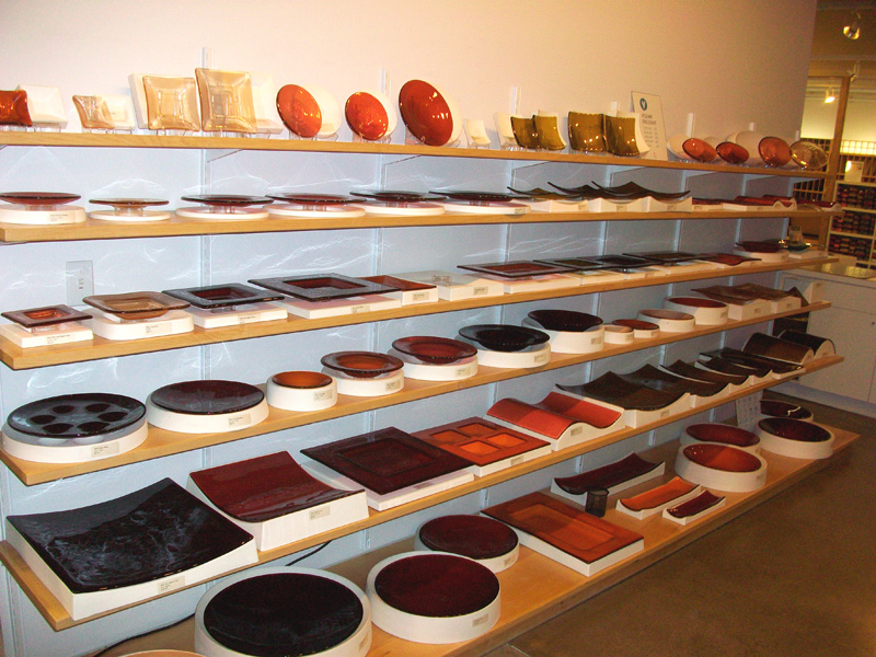
A Bullseye place setting with glass dishes! So cool! This spot was located up the stairs from the main show room. They also had a skinny hallway with some larger glass art on the walls.
On the main level in the show room area they have different shirts, aprons, hats hoodies and such, but I loved this design. This is Oregon state with Bullseye's logo where Portland is :D 

Oregon has a lot of state pride so you will see this emblem lots on mugs, bumper stickers, shirts etc. So you can see how Bullseye took that idea and made their shirt design ;)
See :) Cute huh?

Another item I thought was genius! At the front counter check out there is a glass cylindrical bottle with a metal lid. Think like what they used to put drinking straws in. Inside are Bullseye logs BAND-AIDS! GENIUS! Being a lampworker we are CONSTANTLY getting cuts and burns from glass! How smart of them to take this into account and have them made! They have them in dispensers all over the factory as well :D
So where is this sweet glass pulling we wanted to see? WELL... it's a secret. No, really, it is. So when we went to tour the part where we saw them make sheet glass and rod(which they weren't making that day) we weren't allowed to take pictures. It's a bummer too cause it was SO cool to watch them work! They  take hot ladles of glass, put them inbetween rollers to make a sheet, grab that sheet and send it onto a conveyer belt to cool down and end where a person checks the color of the glass to make sure it matches the stock standard for it's color.

So what did I buy while I was there?
These, BABY! I guess it doesn't look like much small, but they had LOTS of special production greens, and some pinks. That does lead me to another blog I will be doing where I show you how they all look melted!

So be on the look out for that :) I hope you enjoyed my visit! I can't wait to go back!
xo Genea

Wednesday, July 27, 2011

Genea Beads- LAST THURSDAY on ALBERTA- JULY 28TH 6-9PM ACROSS FROM RADIO ROOM

Hello friends!

Just wanted to remind you all that we will be doing our FIRST, Last Thursday on Alberta event on JULY 28TH FROM 6-9PM,  across from Radio Room in their artist reserved spaces! Stop on by and say "Hello"!  

Radio Room 
1101 Northeast Alberta Street
Alberta Street Arts District
Portland, Oregon 97211


We can't wait to see you there!

xo Genea
Friday, July 22, 2011

WING DINGS are back from their travels!

Hello friends!

Well I hadn't really expected to stock the shop today. Infact I really had planned on playing with my new glass from Bullseye(stay turned for that post and more on color)! BUT... then I got the mail and the Wing Dings have returned home after their show tour with my dear friend, Yvonne.

So what do I have in store for you today? How about a little bit for everyone? You like bright colors? I've got your order. You like classic black and white? Got that too. You like earthy? Yep, got your colors covered!


"Clearly Black & White"- Yep that about sums it up! You know what would go great with these? Yep, these!
"Desaturate"- Ok so these aren't new this week, but they would be perfect together!


"Moss & Sand"- Yep, earthy people, these are yours. Sandy brown, rusty red, avocado green.

"Pool Side"- Don't they look refreshing just like a pool with the sun gleaming off the surface of the water? This is for the rest of you dying of HEAT this summer. You will probably hit me, but it's sunny 73 and breezy here! So at least if you can't cool off outside you can feel like you can with these colors ;)

"Rainbow Party"- fitting huh? There are those BRIGHTS!

"The Other Berry"- You know all of those funky fake berry colors they give us like "blue raspberry". Yeah, I guess this is kinda like those ;) At least they don't turn your tongue blue! :P

SO WHAT ELSE IS NEW?...


Well if you missed it above. I visited Bullseye Glass Co finally! I can't believe it took me over a month to finally get there. It may have been the empty pocket book for glass supplies ;) Thanks so mom and dad's birthday gift I stocked up on a few colors I will be sharing with you all later!

SHOW AND TELL....
Not sure what to do with your Wing Dings or glass headpins? Check out these babies I put together for a friends gift. Oh, yeah those SWEET rubber o's. You can find them in My ELEMENTS shop ;)
Here's another one. No, I didn't make the bead. It was created by Sue Stewart. I was asked to assemble it into a pendant for a friend. That SWEET chain, yep, from My ELEMENTS too ;)

Oh I have been meaning to show you my outside studio. Here is what it looks like.
Here's the view behind me. So why aren't I facing that way? Well I need the wall to protect me from gusts of wind. It has a way of blowing your flame all over the place yanno ;)
Well I hope you are staying cool where you are this weekend. It certainly is awesome weather here!

See you soon!

xo Genea


Thursday, July 7, 2011

Portland, OR pics FINALLY and an update

Hello friends!

I know I have promised pictures for awhile. So why the heck has it taken me so long? Well I have taken SO many pictures I might crash this thing if I loaded them all! So to keep things tame I will just load a few pics and if you can't stand it you can always drop by my facebook profile to check out all of them. Just be forewarned. My profile is fair game for all sorts of craziness and you will have to send a request to check things out. Unfortunately in the past I had to add that option to avoid some unpleasantries.  Anyways.... about those pictures!...

Here is Cannon Beach in Ecola State Park. Isn't it incredible?! The pictures don't even do it justice! These are pics of the Oregon coast.

Recognize it? Yeah, I wouldn't have either! This is the Goonies house! It is a real house located in Astoria, Oregon! You can't go inside, but you can walk up to the house and take pictures :)

View of the rocks you see in the Goonies from the cliff. The rocks you see in the movie are that string of triangular shaped rocks. We are on the right side of them. They are more obvious when you see them head on. We went to the state park instead of directly on the beach in front of them.

We were adventurous enough to find a way down a cliff side to get to the beach. We were lucky too since it appeared the tide must have been low uncovering amazing creatures that are normally covered up by the sea. Here are some small sea anemone. 

A green anemone. Isn't it pretty?! I was tempted to poke it's little tendrils, but I didn't know if it would sting so I just touched it's slimy top instead ;)

Another view from the cliff at Cannon Beach.

LOOK! A starfish! This is the first live one I have ever seen! Isn't he cool?!

A cluster of trees on the cliff at Cannon Beach.

The doughnut carousel at VooDoo Doughnuts! 

Here is the menu and front counter at the original VooDoo Doughnuts. It is open 24 hours and there is ALWAYS a long line to get in!

Ahhh the food carts! This is a total Portland, OR thing! There are clusters of food carts all over town with amazing food! This is the one at 50th and Division. The food carts are usually found in clusters all over town. They have a center area for seating and are open different times of the day depending on the area of town. They all have AMAZING food and great prices!

Holy crap! Is this awesome, or what? Not only do they recycle at the fast food chains here, but they COMPOST TOO! This is at Burgerville. Their burgers are even made out of grassfed beef! NICE!!

The Hollywood district. All the areas of town are broken up by districts. This is the sign over by where Ricky works. 

A side view of Jodi's(our roommate) backyard. I love spending time on the deck drinking my morning coffee :D

By the side of the deck. My outdoor studio is in that back corner. I need to snap a pic of it all set up for you all :)

Pad Thai and Thai iced tea from Run Chicken Run food cart. This meal was $6.50 for the Pad Thai and $2.00 for the tea. What a swingin' deal!! It was delicious too!

A view of the river while crossing one of Portlands many bridges. This is the Willamet river.

Run chicken Run cart.

A super sweet sign that is located at Pioneer Square in Downtown Portland.

TOOL UPDATE....

Ok so I haven't officially purchased tools yet, but I thought you all might be interested in my finds. Many of you suggested Harbor Freight, which looks like it might be my best bet as far as cost and the fact that they have one locally. My other choice was Widget Supply which is also local to Portland and would be free shipping since my order would be over $100. Have a looksy :)

IN OTHER NEWS...

I will be attending the first bead show since I've moved here. It's being put on by Gem Faire. It will be fun to go with Ricky and check things out. I have not heard of many of the vendors so it will be exciting to meet people from this area.

I was excited to be accepted into the Portland Area Etsy group, PDX Etsy! There are currently 821 members! I am excited to meet up with them on July 23rd!

I have also managed to land myself a spot to set up for Last Thursday on Alberta. The last Thursday of every month they close down Alberta street so artists and performers can gather. I had a really wonderful time on my first visit this past June 30th and can't wait to be a vendor at the end of this month! I will be located at Radio Room. I really LOVE this sweet little bar/espresso bar. They have an awesome upstairs outdoor area as well as a downstairs outdoor area with a fire pit!

Well that includes my update for today. I will be busily working to stock the shop and prepare for my upcoming show! 

I hope you are enjoying your summer!

xo Genea